CSS gradients are one of those features that look simple on the surface but hide an enormous amount of expressive power underneath. A two-color linear-gradient will get you through a weekend project, but if you’ve ever wondered how designers pull off those silky smooth hero sections, glowing buttons, or aurora-like backgrounds, the answer is almost always: gradients—just used more thoughtfully.
In this guide we’ll walk through every gradient type CSS supports, the syntax tricks that make them feel modern, and the common mistakes that produce the dreaded “gray dead zone” in the middle of your color blends. By the end you’ll be able to write gradients by hand—and know exactly when to skip the hand-coding and reach for a generator instead.
Why Gradients Matter More Than You Think
Flat design ruled the 2010s, but the pendulum has swung back. Modern interfaces lean heavily on subtle depth, glowing accents, and atmospheric backgrounds. Gradients are how you get that look without shipping a single image. They scale infinitely, weigh nothing, animate cheaply, and adapt to dark mode if you set them up right.
They’re also a brand asset. Stripe, Linear, Vercel, and countless others built immediately recognizable visual identities around specific gradient palettes. You can do the same.
Linear Gradients: The Workhorse
The linear-gradient() function is where everyone starts. The minimal form looks like this:
background: linear-gradient(#ff7e5f, #feb47b);
That gives you a top-to-bottom blend. To change direction, add an angle or a keyword:
background: linear-gradient(135deg, #ff7e5f, #feb47b);
background: linear-gradient(to right, #ff7e5f, #feb47b);
Angles in CSS gradients are measured from the top, going clockwise. So 0deg is bottom-to-top, 90deg is left-to-right, 180deg is top-to-bottom. This trips people up constantly because it’s the opposite of the math convention.
Color Stops
You aren’t limited to two colors. You can add as many stops as you like, and you can position each one with a percentage:
background: linear-gradient(
  90deg,
  #0f172a 0%,
  #1e3a8a 40%,
  #7c3aed 70%,
  #ec4899 100%
);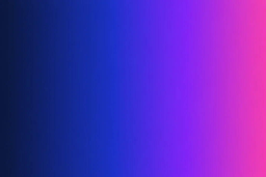
The percentage tells the browser where each color should sit along the gradient line. If you skip the percentages, the browser distributes colors evenly. If you give the same color two stops in a row (like red 50%, blue 50%), you get a hard edge—useful for stripes and split backgrounds.
Radial Gradients: The Spotlight
Radial gradients radiate outward from a point. They’re perfect for spotlight effects, glowing orbs, and soft backgrounds that draw the eye to the center.
background: radial-gradient(circle at center, #fbbf24, #b45309);You can change the shape (circle or ellipse), the size (closest-side, farthest-corner, etc.), and the origin (at top left, at 30% 70%). A subtle radial gradient anchored at the top of a hero section looks fantastic:
background: radial-gradient(
  ellipse at top,
  rgba(124, 58, 237, 0.4),
  transparent 60%
), #0f172a;
Notice the layering trick: you can stack multiple gradients separated by commas, and the topmost one wins where it’s opaque.
Conic Gradients: The Pie Chart Engine
Conic gradients sweep around a center point like the hand of a clock. They’re how you build pie charts, color wheels, and those swirly backgrounds that look complicated but are really just one line of CSS.
background: conic-gradient(
  from 0deg at 50% 50%,
  #ef4444,
  #f59e0b,
  #10b981,
  #3b82f6,
  #8b5cf6,
  #ef4444
);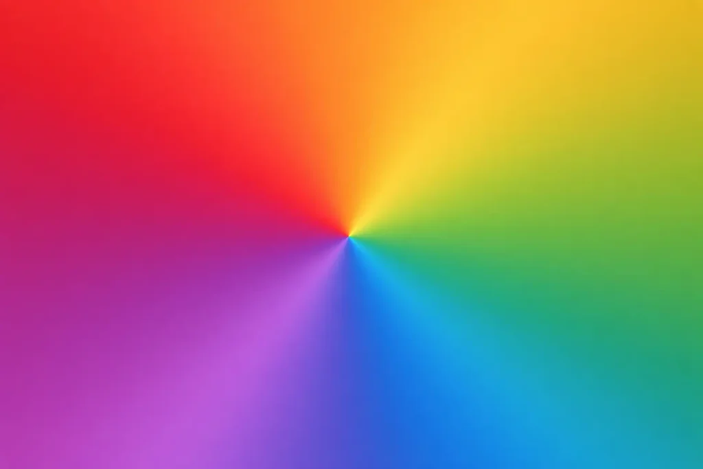
Repeating the first color at the end makes the seam invisible. If you want a hard-edged pie chart, just use percentages:
background: conic-gradient(
  #3b82f6 0% 25%,
  #10b981 25% 60%,
  #f59e0b 60% 100%
);
The Gray Dead Zone (and How to Fix It)
Here’s the thing nobody tells beginners. If you write linear-gradient(blue, yellow), you’ll see an ugly muddy gray-green band in the middle. That’s because the browser interpolates in sRGB by default, and sRGB does horrible things to perceptual brightness.
Modern CSS lets you fix this with the in keyword:
background: linear-gradient(in oklch, blue, yellow);oklch is a perceptually uniform color space, and the difference is dramatic. The midpoint stays bright and saturated instead of collapsing into mud. Other valid options include oklab, lch, lab, and hsl. For most designs, oklch is the right default in 2026.
If you need to convert hex colors to OKLCH or back, that’s exactly what color converters are for.
Animating Gradients
Gradients themselves can’t be animated directly with the transition property—browsers don’t know how to interpolate between two background-image values. The workaround is to animate background-position on an oversized gradient:
.button {
  background: linear-gradient(90deg, #ec4899, #8b5cf6, #3b82f6, #ec4899);
  background-size: 300% 100%;
  transition: background-position 0.6s ease;
}
.button:hover {
  background-position: 100% 0;
}The result is a smooth color shift on hover that feels expensive but costs nothing.
Mesh Gradients (Without a Plugin)
True mesh gradients aren’t supported in CSS yet, but you can fake them convincingly by stacking several radial gradients of different colors at different positions:
background:
  radial-gradient(at 20% 20%, #f472b6 0px, transparent 50%),
  radial-gradient(at 80% 0%, #818cf8 0px, transparent 50%),
  radial-gradient(at 0% 50%, #34d399 0px, transparent 50%),
  radial-gradient(at 80% 80%, #fbbf24 0px, transparent 50%),
  #0f172a;
Each radial blob bleeds into the others, producing that dreamy, blurred-watercolor look you see on landing pages everywhere. It’s worth experimenting with the positions and the base color until something clicks.
Picking Colors That Actually Work Together
The best gradient in the world will fall flat if the colors clash. A few rules of thumb:
Pick colors that are close on the hue wheel for harmony, or opposite for drama—but not random distances apart, which is what produces that muddy look. Keep saturation roughly consistent across stops. And test your gradient on both light and dark backgrounds, because what looks rich on white can look washed out on black.
If you don’t have a color in mind, pulling one from an image or a screenshot is often the fastest way to get started.
Performance Notes
Gradients are cheap, but not free. A single gradient on a single element costs essentially nothing. Stacking ten radial gradients with blur filters on a full-screen hero will drop frame rates on mid-range phones. If you’re animating, prefer transform and opacity over background-position when you can, and always test on real devices.
For static gradients that never change, consider rendering them once to a CSS variable so you’re not redeclaring them on every selector. And remember that gradient backgrounds don’t print well by default—if printability matters, provide a fallback solid color.
Putting It All Together
Here’s a hero background that uses everything we covered—a base dark color, two soft radial spots for atmosphere, and an OKLCH linear gradient on top for a subtle wash:
.hero {
  background:
    linear-gradient(in oklch, rgba(15, 23, 42, 0) 0%, rgba(15, 23, 42, 0.6) 100%),
    radial-gradient(ellipse at 20% 30%, rgba(124, 58, 237, 0.5), transparent 60%),
    radial-gradient(ellipse at 80% 70%, rgba(236, 72, 153, 0.4), transparent 60%),
    #0f172a;
}
Drop that into any project and you’ll get a hero section that looks like it took an afternoon to design. It took thirty seconds.
Wrapping Up
Gradients are one of the highest-leverage tools in CSS. They’re tiny, they scale, and they make interfaces feel alive without a single image asset. The syntax is more flexible than most people realize—linear, radial, conic, layered, OKLCH-aware—and once you internalize the basics you can build almost any modern background by hand.
That said, there’s no shame in using a generator for the fiddly parts. Tweaking color stops in a live preview is way faster than guessing percentages in a stylesheet, especially when you’re trying to nail a specific brand look. Use the generator for exploration, then bring the final CSS into your project and tweak from there.