
Color is one of the most powerful tools in a web designer’s toolkit. It guides attention, conveys emotion, builds brand identity, and — when done right — makes the difference between a site users love and one they leave. Yet many designers and developers choose colors based on gut feeling alone.
This guide breaks down the fundamentals of color theory and shows you how to apply them to real web design projects — no art degree required.
Why Color Matters in Web Design
Before diving into theory, let’s talk about why color deserves your careful attention.
Research consistently shows that people form first impressions of a website within 50 milliseconds, and color plays a dominant role in that snap judgment. A study published in the journal Management Decision found that up to 90% of initial product assessments are based on color alone.
In web design, color serves four critical functions:
Hierarchy and Navigation — Color draws the eye to what matters most.

A bright call-to-action button against a neutral background instantly tells users where to click.
Brand Recognition — Think of Coca-Cola’s red, Facebook’s blue, or Spotify’s green.

Consistent color use increases brand recognition by up to 80%.
Emotional Response — Colors trigger psychological responses. Blue feels trustworthy. Red creates urgency. Green suggests growth.
Accessibility — Proper color contrast ensures your content is readable for everyone, including the estimated 300 million people worldwide with color vision deficiency.
The Color Wheel: Your Starting Point

The color wheel, first developed by Isaac Newton in 1666, organizes colors in a circle that reveals their relationships. Understanding these relationships is the foundation of every color decision you’ll make.
Primary, Secondary, and Tertiary Colors
In the traditional model used in design (the RYB model), the structure is simple:
- Primary colors — Red, yellow, and blue. These can’t be created by mixing other colors.
- Secondary colors — Orange, green, and purple. Created by mixing two primaries.
- Tertiary colors — Red-orange, yellow-green, blue-violet, and so on. Created by mixing a primary with an adjacent secondary.
In digital design, we work with the RGB (Red, Green, Blue) model for screens and HSL (Hue, Saturation, Lightness) for more intuitive color manipulation. HSL is particularly useful because it separates the “what color” (hue) from the “how vivid” (saturation) and “how bright” (lightness).
Warm vs. Cool Colors
he color wheel divides neatly into two halves:
- Warm colors (reds, oranges, yellows) — Energetic, passionate, attention-grabbing. Great for CTAs and highlights.
- Cool colors (blues, greens, purples) — Calming, professional, trustworthy. Common in corporate and healthcare sites.
This doesn’t mean you should use only warm or only cool. The best designs create contrast between the two — a cool-toned site with warm accent colors, for example.
Color Harmony: Five Schemes That Work
Color harmony is the art of combining colors that look good together. Here are the five most useful schemes for web design.
1. Monochromatic
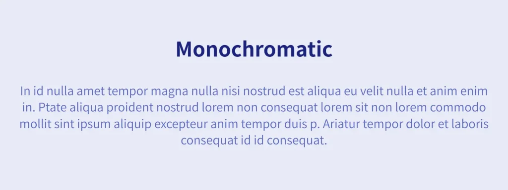
One base hue with variations in saturation and lightness. This is the safest scheme and creates a clean, cohesive look.
Best for: Minimalist designs, portfolios, single-brand pages.
Example: A dark navy (#1A237E) for headings, medium blue (#5C6BC0) for body text, and light blue (#E8EAF6) for backgrounds.
2. Complementary
Two colors opposite each other on the color wheel. This creates maximum contrast and visual impact.
Best for: CTAs that need to pop, landing pages, attention-grabbing sections.
Example: Blue (#4285F4) and orange (#FF9800). The blue dominates as the primary, while orange highlights the most important actions.
Warning: Don’t use complementary colors in equal amounts — one should dominate (about 70%) while the other accents (about 30%).
3. Analogous
Three colors adjacent to each other on the wheel. This feels natural and harmonious.
Best for: Blogs, editorial sites, nature-themed brands.
Example: Blue (#4285F4), blue-green (#00ACC1), and green (#34A853). Smooth transitions that feel organic.
4. Triadic
Three colors equally spaced on the wheel (120° apart). Vibrant and balanced.
Best for: Creative agencies, children’s brands, playful interfaces.
Example: Red (#EA4335), blue (#4285F4), and yellow (#FBBC04). Bold and energetic when used carefully.
5. Split-Complementary
One base color plus the two colors adjacent to its complement. Offers contrast with less tension than full complementary.
Best for: Versatile designs that need both variety and balance.
Example: Blue (#4285F4) as the base, with yellow-orange (#FFB74D) and red-orange (#FF7043) as accents.
The 60-30-10 Rule
Professional interior designers have used this ratio for decades, and it works beautifully in web design too:
- 60% — Dominant color. Your background and large surfaces. Usually a neutral or muted tone.
- 30% — Secondary color. Navigation, sidebars, cards. Supports the dominant without competing.
- 10% — Accent color. Buttons, links, icons, highlights. This is where your brand color shines.
This ratio creates visual balance without overwhelming the user. Most successful websites follow this pattern, even if the designers didn’t consciously plan it.
Applying 60-30-10 in CSS
Here’s how this looks in practice with CSS custom properties:
:root {
  --color-dominant: #FAFBFC;   /* 60% — light background */
  --color-secondary: #FFFFFF;  /* 30% — cards, sections */
  --color-accent: #4285F4;     /* 10% — buttons, links */
}
The accent color is the one users remember. Make it count.
Color Psychology in Web Design
Different colors trigger different psychological responses. While these associations aren’t universal — they vary by culture — here are the most common associations in Western web design:
- Blue — Trust, stability, professionalism. The most popular color in web design. Used by Facebook, Twitter, LinkedIn, and most financial institutions.
- Red — Urgency, passion, energy. Effective for CTAs and sale notifications. Used by YouTube, Netflix, and Pinterest.
- Green — Growth, health, nature, success. Common in fintech, health, and environmental sites. Used by Spotify, Robinhood, and WhatsApp.
- Yellow — Optimism, warmth, attention. Use sparingly — it’s hard to read as text. Works as a highlight color. Used by Snapchat and IKEA.
- Purple — Creativity, luxury, wisdom. Popular in beauty, tech, and premium brands. Used by Twitch, Cadbury, and Hallmark.
- Orange — Friendliness, confidence, fun. Great for CTAs because it combines red’s energy with yellow’s warmth. Used by Amazon’s buy button, Fanta, and HubSpot.
- Black — Sophistication, luxury, power. Common in fashion and premium brands. Used by Apple, Chanel, and Nike.
Cultural Considerations
If your audience is global, be aware of cultural differences:
- White means purity in Western cultures but mourning in parts of East Asia.
- Red signifies good luck in China but danger in Western contexts.
- Green is sacred in Islam and associated with nature universally.
When in doubt, research your specific audience’s cultural context.
Accessibility: Contrast and Color Vision
Beautiful colors mean nothing if users can’t read your content. Accessibility isn’t just ethical — it’s practical. Roughly 8% of men and 0.5% of women have some form of color vision deficiency.
WCAG Contrast Requirements
The Web Content Accessibility Guidelines (WCAG) define minimum contrast ratios:
- AA Standard (minimum): 4.5:1 for normal text, 3:1 for large text (18px+ bold or 24px+ regular).
- AAA Standard (enhanced): 7:1 for normal text, 4.5:1 for large text.
For example, light gray text (#9AA0A6) on a white background (#FFFFFF) has a contrast ratio of only 2.85:1 — failing both AA and AAA standards. Darkening it to #5F6368 brings the ratio to 5.74:1, passing AA.
Don’t Rely on Color Alone
Never use color as the only way to convey information. If error messages are red, also include an icon or text label. If charts use color to distinguish data series, also use patterns or labels.
Building a Web Color Palette: Step by Step
Ready to create your own palette? Here’s a practical workflow:
Step 1: Start With Your Brand Color
Choose one primary color that represents your brand’s personality. This becomes your accent (the 10% in the 60-30-10 rule).
Step 2: Generate a Scheme
Use your primary color as the base to generate a complementary, analogous, or triadic scheme.
Step 3: Add Neutrals
Most of your palette should be neutrals. Create a scale from near-white to near-black:
- Background: #FAFBFC
- Surface: #FFFFFF
- Border: #ECEEF1
- Muted text: #9AA0A6
- Secondary text: #5F6368
- Primary text: #1A1A2E
Step 4: Define Semantic Colors
Add functional colors that are consistent across your site:
- Success: Green (#34A853)
- Warning: Yellow (#FBBC04)
- Error: Red (#EA4335)
- Info: Blue (#4285F4)
Step 5: Test Contrast
Check every text-background combination against WCAG standards. Fix any that fail.
Step 6: Document Everything
Create a style guide with your palette, including exact HEX values, usage rules, and do/don’t examples. This ensures consistency as your site grows.
Common Color Mistakes to Avoid
Even experienced designers make these errors:
Too many colors. Stick to 3–5 colors maximum. Every additional color makes your design harder to maintain and less cohesive.
Ignoring contrast. That light gray text might look elegant on your retina display, but it’s unreadable on older monitors and in bright sunlight.
Inconsistent usage. If blue means “clickable” in one section, don’t use it decoratively elsewhere. Users learn your color language — don’t confuse them.
Forgetting dark mode. If you offer a dark theme, your palette needs a complete inversion strategy. Colors that work on white backgrounds rarely work on dark ones without adjustment.
Pure black text. #000000 on #FFFFFF creates harsh contrast that causes eye strain. Use a very dark gray (#1A1A2E) instead for a softer reading experience.
Conclusion
Color theory isn’t just academic — it’s the foundation of every visual decision on your website. Start with the basics: understand the color wheel, pick a harmony scheme, follow the 60-30-10 rule, and always check your contrast ratios.
The best part? You don’t need expensive tools to get started. Experiment with different palettes, test them against accessibility standards, and iterate based on user feedback.
Your website’s colors tell a story before users read a single word. Make sure it’s the right one.